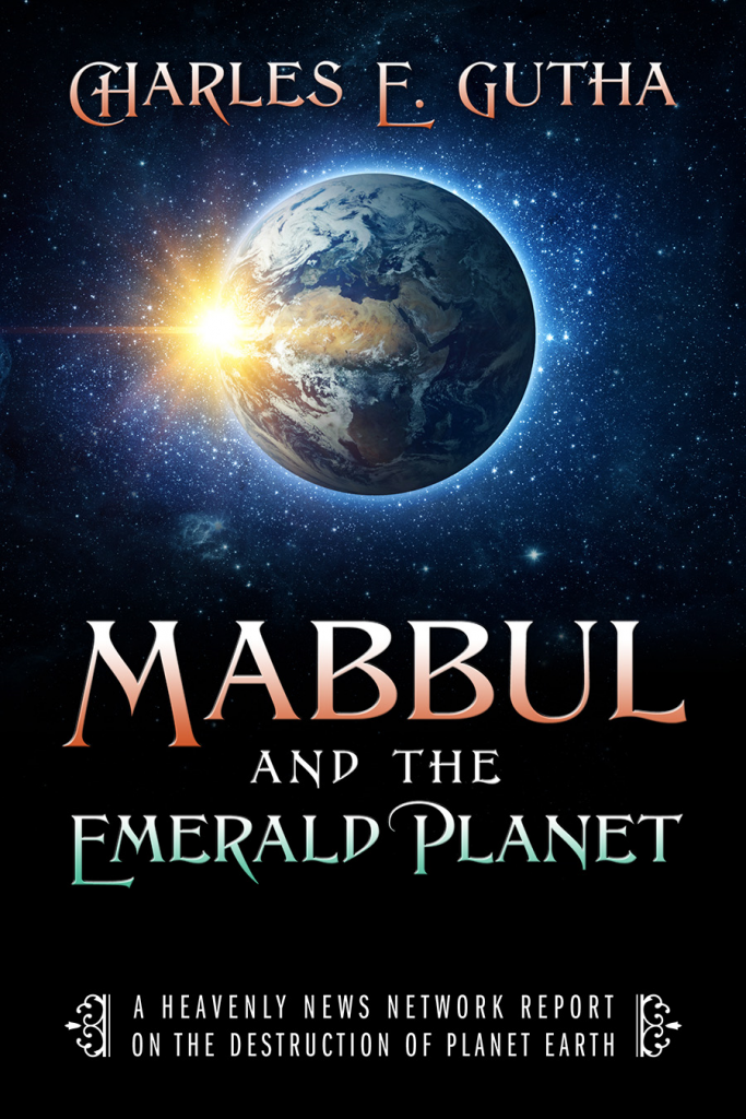
I cut and pasted to make this arrangement. cover 3-2or cover 3-3
let me know which basic design you like better.
13 thoughts on “Front Covers Revised”
3-3 first choice with 3-2 a close second. As we discussed before, until you are famous (or at least have several books out) the title should be before the author.
Hi Charles, I feel the Ark cover is more appealing and eye catching as one commented before the others look more like science fiction and that isn’t what your looking for. Also possible could put a small earth in middle between the Emerald Planet words and the rest of words telling what the book is about. The other covers aren’t appealing for what you what to inform readers about.
Good luck in your endeavor. Judy Brooks
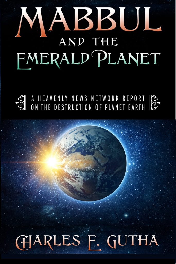
3-3 first choice with 3-2 a close second. As we discussed before, until you are famous (or at least have several books out) the title should be before the author.
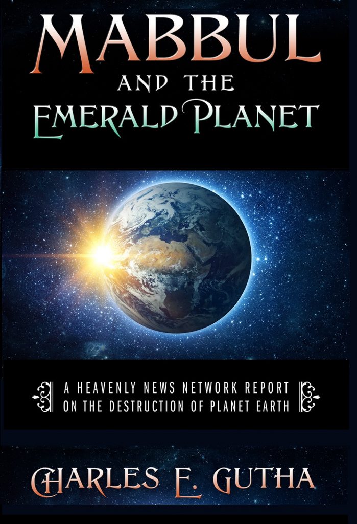
My favorite it number 3
Congratulations! I like the third one!
Hi Julia, it’s been a long time. thanks
Third or Bottom – I think looks better balanced. Final Decision.
Dan
I like the 2nd 1.
Dann Gunn
Hi Charles, I feel the Ark cover is more appealing and eye catching as one commented before the others look more like science fiction and that isn’t what your looking for. Also possible could put a small earth in middle between the Emerald Planet words and the rest of words telling what the book is about. The other covers aren’t appealing for what you what to inform readers about.
Good luck in your endeavor. Judy Brooks
THIS WON’T HELP I LIKE ALL THE FONTS, PICTURES, AND ALL THE COVERS. EVERY ONE OF THEM WOULD BE VERY ATTRACTIVE. ANDRE
The first one looks the most professional and good. 🙂
the first one was what they sent me. the others are me cutting and pasting
The first because my eye sees the subject first, then I read down. If I want to read it my eyes will go back to author’s name.
Cover 3 :3
I agree with all who like number 3. It looks good!